Under The Covers: On-U Sound
Originally written for Red Bull Music Academy by James Hines

Alongside contemporary imprints like Factory Records, Cherry Red and Rough Trade, On-U were key exponents of the adventurous post-punk spirit, taking the energy and urgency of punk and moulding it into challenging new forms. Acts like New Age Steppers, African Head Charge and Singers & Players embraced politics, activism, exotic rhythms and ethnic sounds, and the label’s unique brand of weird, atmospheric dub and freewheeling studio experimentation was echoed by a visual identity just as striking as the sounds they were committing to vinyl.
In recent years, On-U Sound has been enjoying a renaissance, with key albums issued on vinyl again for the first time since the 80s. We spoke with Adrian Sherwood and Kishi Yamamoto, the designer and photographer who had a key role in shaping the label’s visual identity, to find what made On-U’s visuals so special.

New Age Steppers – Action Battlefield (1981)
Adrian: We’re all on this sleeve. Kishi is there, and I’m there, rolling a cigarette, and the band of course. I had done the first couple of sleeves, the New Age Steppers and the Mothmen sleeves, and they were alright. Kishi came along and she was running a magazine in Japan, and we became a couple. She‘s a really great photographer, and had done a lot of work already for labels like 99 in New York. The first thing she did was the collage for New Age Steppers’ Action Battlefield. We hadn’t yet found the On-U style yet, but her photographs were so good we started to feature more and more of her photography on the artwork.
Kishi: I don’t remember where the background components came from, but the black and white images are mine. I took some snaps of Ari [Up] and Neneh [Cherry] dancing. My graphic designer friend was appalled by its poor collage technique and told me so but I think he meant that the Letraset wasn’t stuck down on a straight line. Everything was analogue and hand-made in those days!
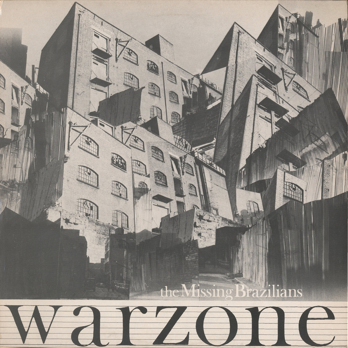
The Missing Brazilians – Warzone (1984)
Adrian: That was Metropolitan Wharf in Wapping. At the time Wapping was just starting to get a bit trendy, but just before that it was quite rough. Kishi had been taking all these photos of the area, and it wasn’t a warzone, but with the layered collage technique had made it look really cool. Kishi was doing all this in the darkroom, playing with the light, exposure, all those things. It gives the sleeve a real charm which I think is missing a lot these days.
Kishi: We were based in Metropolitan Wharf in Wapping at the time. I had a darkroom there. [British designer] Ally Capellino was downstairs. It was a desolate place. There was a monstrous dog on the loose. The police came round to check up on us one evening as there was a madman with an axe running around in the neighbourhood. The place always stank of some rotten water from the Thames. We used to receive deliveries of records and CDs lifted on a hoist to the fourth floor, which swung and swayed wildly. One day I went out and took photos of some half-empty warehouses nearby. I went back to my darkroom and this was what I came up with. The image is about the place as well as the music. Then the property prices started to rise and we had to leave.
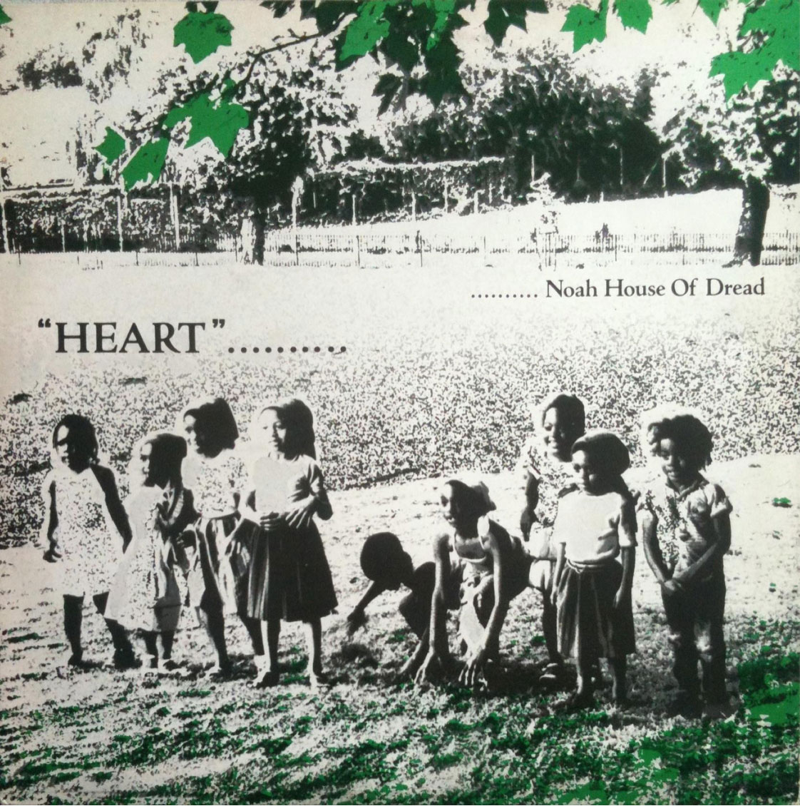
Noah House Of Dread – Heart (1982)
Adrian: Now those kids are all parents – grandparents even! Kishi came back from that day really happy, she loved having the kids around. We didn’t want our records to sound Jamaican or anything, and the same goes for the artwork. We were after a sound of our own, and at that time, if you looked at the reggae sleeves coming out, they were pretty awful to be honest, so we weren’t trying to emulate that, or have the sleeve look like some yard type scene.
Kishi: Noah House Of Dread was On-U Sound’s main percussionist Bonjo Iyabinghi Noah’s pet project. He wanted to make an album that’s about classic one-drop reggae, about Rasta, about love, about Jah. Bonjo got some friends and their kids together and we all went to Victoria Park in Hackney, a few minutes walk from where Bonjo lived, to take some photos. I got some great shots that day but this cover photo is not the best one. There is another photo of the same group of kids in which every child is looking a different way, doing a different thing, thinking a different thought. It was a magic moment – my Cartier-Bresson moment that only a camera could capture.

Singers And Players – War Of Words (1982)
Adrian: It really stood out from the Jamaican thing really, which were quite twee in a way. This was sort of modelled on Bim Sherman’s earlier album cover for Lovers Leap, and to this day I think it’s a really striking sleeve. He might have been unsure about it, and wondering why it wasn’t red, gold, and green or whatever, but it looked so great in black and white.
Kishi: Bim was very photogenic but he hated being photographed. He was probably thinking: "Why did she choose the one with my eyes closed?" I thought it looked more beautiful and interesting. Dictatorship ruled the On-U Sound art department in those days!
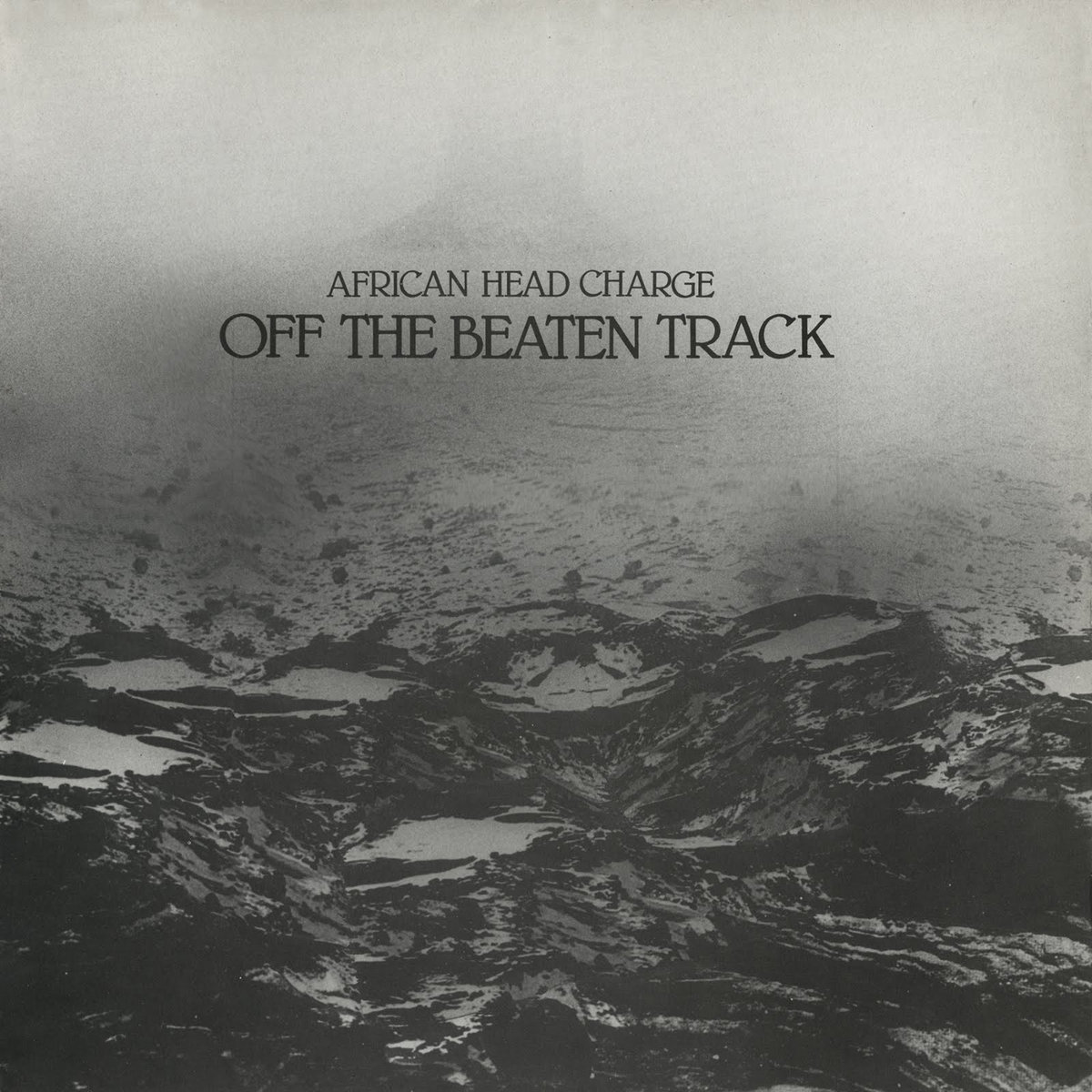
African Head Charge – Off The Beaten Track (1986)
Adrian: It’s a sort of moon landscape, again done with Kishi playing around in the darkroom. I love this sleeve. I had been introduced to the cut and paste techniques of William Burroughs by Mark Stewart from The Pop Group. Mark had been doing a lot of that sort of stuff with his own sleeves, and we just really liked that approach. A lot of the [music] productions were like collage, too – there was a lot of cutting and pasting.
Kishi: I think I used three versions of one image of the Sahara Desert in vertical panels. The centre image is Devils Tower in Wyoming.

Bim Sherman – Across The Red Sea (1982)
Adrian: It took a while before people started making comments about how much they liked the artwork, because people were bombarded at the time with so many good releases. Sometimes we were knocking out a record and the artwork in three or four days, just to keep us going. We couldn’t afford to sit back, we had to release something to pay for the last one.
Kishi: Most amateur artistic photography – as opposed to professional commercial photography – was done in black and white back in the day. We did most of our sleeves in black and white, sometimes with one spot colour, because it was cheap.
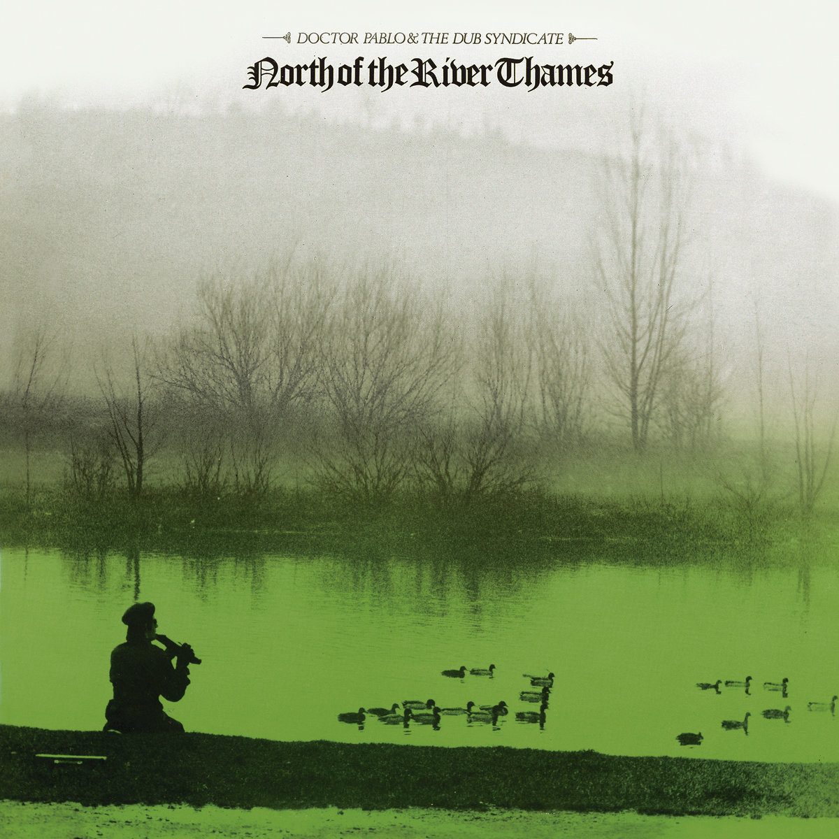
Doctor Pablo & Dub Syndicate – North Of The River Thames (1984)
Adrian: That was down near Cookham. Pete [Dr Pablo] sat there with the ducks swimming by, wearing his Citizen Smith beret.
Kishi: The photo was taken by the then Mrs Pablo. He wanted to release his own East Of The River Nile and had this idea for a long time.
Adrian: We just gave it a really simple treatment to make it look a bit mystical. It’s got some humour in it too, and I think it worked really well. You know, like Lee Perry, you’ve got to have a bit of mischief and fun about things too. Me and Pete have been mates for years, he’s a plumber now.
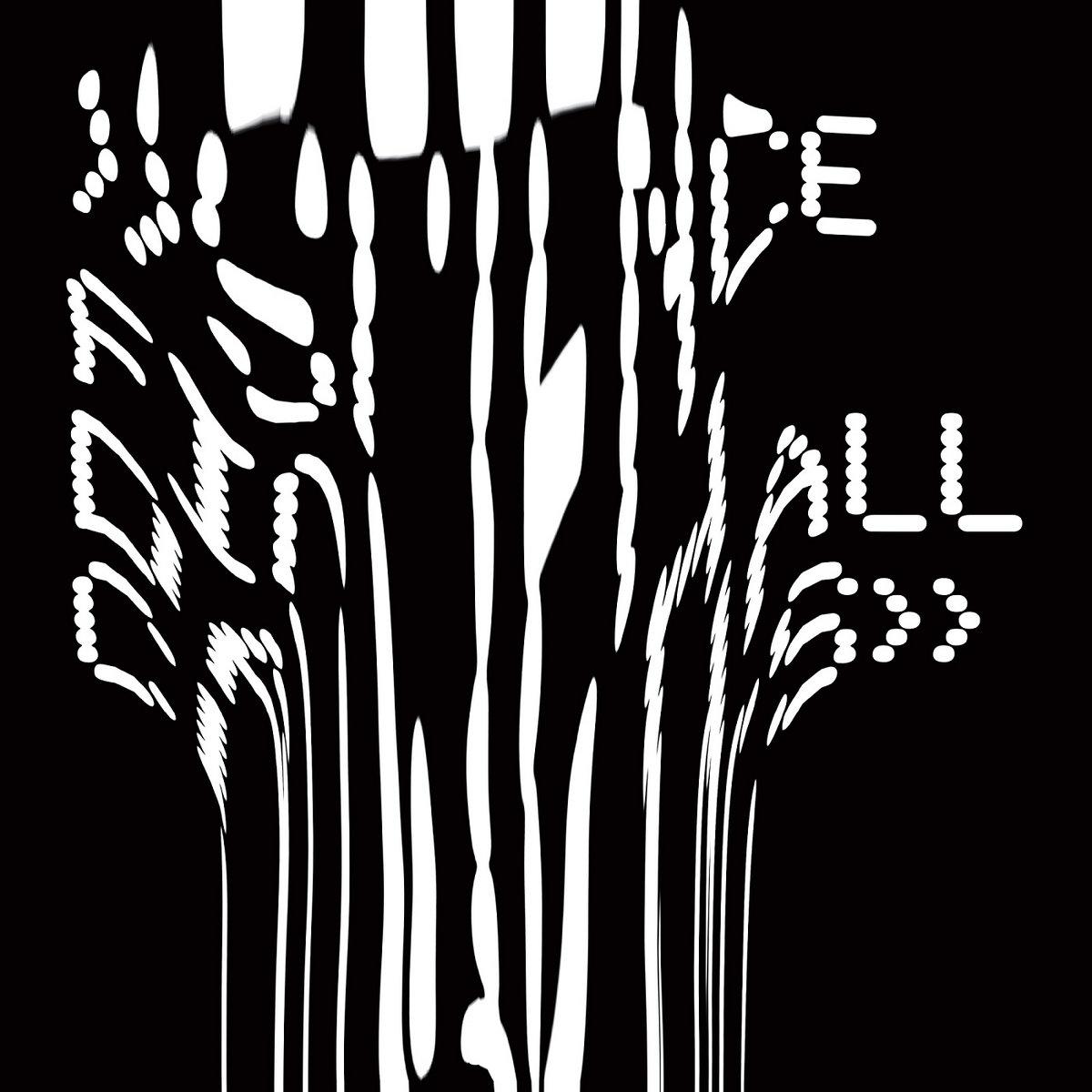
Trevor Jackson Presents: Science Fiction Dancehall Classics (2015)
Trevor Jackson (compilation curator): Approaching the artwork for Science Fiction Dancehall Classics, I strongly felt I needed to pay homage to the mid-80s period of On-U sleeves that was such a huge influence on me as a young creative. I took the same font that was used for Tackhead, and then applied extreme analogue manipulation to it, in the same way that Adrian heavily manipulates the sound.
Kishi’s early sleeves were a big inspiration to me and one of my first introductions to collage work, which for me had an affinity with early audio sampling of the same period. The fact that a lot of them were heavily political made them even more powerful. I’m particularly fond of the run of stark black and white twelve-inches from around 1985 or 86 like What’s My Mission Now? by Tackhead, Hard Left by Gary Clail and Hypnotized by Mark Stewart.